
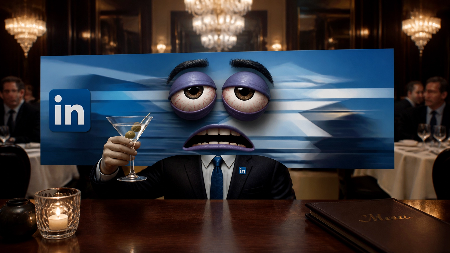
Listen, I need to get something off my chest. I’m tired. I’m pixelated. And frankly, I’ve been stretched thinner than the margins of a casual dining spot in mid-July.
I am your LinkedIn background. You know, that rectangular strip of digital real estate at the top of your profile that you haven’t thought about since 2018? Yeah, that’s me. I’ve been sitting here, silently judging your choices, while you focus on your "About" section and whether or not your headshot makes you look like a CEO or a guy who just got lost in a Men’s Wearhouse.
People keep asking: “Are LinkedIn backgrounds dead? Does anyone actually look at that stretched blue geometric nightmare anymore?”
As the guy living it, let me tell you: We aren't dead. We’re just neglected. And if you’re a restaurant owner or a hospitality executive, you’re missing out on the biggest billboard you own, and it’s free. (Well, free-ish, unless you count the cost of your dignity when you use a low-res photo of a bridge in San Francisco you’ve never actually visited.)
The "Stretched Blue Aesthetic" and Other Corporate Horrors
Let’s talk about the Elephant in the Room (which, incidentally, would make a better banner than what most of you have). For a solid decade, the default aesthetic for LinkedIn was what I call "The Constellation of Boredom." You know the one, those blue dots connected by lines that look like a spider had a stroke while thinking about "networking."
If your current background is a stretched-out, blurry photo of a generic city skyline or, heaven forbid, the default gray "constellation" from 2014, you are essentially telling the world: "I have the creative vision of a lukewarm bowl of oatmeal."
(I’m sorry if that was harsh. I’ve had a lot of martinis today. It’s lonely up here at the top of the page.)
In the branding and identity game, first impressions aren't just important, they're everything. When a potential investor, a future franchise partner, or a top-tier Chef de Cuisine lands on your profile, I’m the first thing they see. If I look like a technical glitch, they’re going to assume your POS integration looks exactly the same.

Why Restaurant People Have It Better (The Visual Advantage)
Here’s the thing that drives me crazy: You guys work in the most visual, sensory-rich industry on the planet! You spend thousands on interior design, lighting, and plating that makes people take their phones out before they even take a bite.
And yet, your LinkedIn background looks like a spreadsheet had a bad dream.
Why aren't you using me to showcase that stunning open kitchen? Why am I not a high-res, mouth-watering shot of your signature dish that makes people want to lick their screens? (Don't actually lick the screen, it's unsanitary, and we just got through a pandemic, remember?)
Hospitality is about experience. If your LinkedIn profile doesn't feel like an experience, you’re failing the brand. According to LinkedIn’s own best practices, your banner is prime real estate for "storytelling." Use it.
The Anatomy of a Banner That Doesn't Suck
If you want to stop being a "background character" (get it? I'm hilarious), here is what you need to do. Ready? Aprons on.
- Stop with the Generic Stock: If I see one more blurry bridge or a "handshake" photo, I’m going to delete myself. Use authentic imagery. A photo of you and your team in the weeds on a Saturday night says more about your leadership than a quote about "synergy" ever will.
- The Rule of Thirds (and Headshots): Remember that your profile picture is going to cover the bottom left-ish part of me on desktop and the middle of me on mobile. Don't put your restaurant's logo right where your head is going to be. Unless you want your logo to be your hat. (Actually, that could be a look, but let’s stick to the basics for now.)
- Social Proof is Sexy: If you’ve won awards, put those logos on me! If your restaurant was featured in Forbes or Eater, let the world know. I can handle the weight of a few Michelin stars, I promise.
- A Clear Value Prop: Use text, but keep it punchy. "Scaling guest-centric brands" is better than "Expert in various aspects of the hospitality sector including but not limited to operations and supply chain management." Boring wins. Boring pays. But boring is also… well, boring. Make it snappy.

Technical Specs (The "Eat Your Vegetables" Section)
I know, I know. You’re a "big picture" person. You don’t care about pixels. But guess what? I do. I’m the one who has to look at myself in the mirror every day.
- Dimensions: 1584 x 396 pixels. That is the magic number. If you ignore this, I will stretch. I will blur. I will make you look like you don't know how to use a computer.
- File Type: JPG or PNG.
- Design Tools: If you aren't a designer, use Canva. They have templates. Just… please, for the love of all that is holy, don't use the first template that pops up. Everyone uses that one. You're a strategic leader, not a template-follower.
Is It Dead? No. It’s Just Evolving.
LinkedIn recently introduced "slideshow" banners for some users. That’s right: I might soon have siblings! You can rotate through different images: one for your main brand, one for social proof, and one for your latest growth strategy or campaign.
The background isn’t dead; it’s becoming a billboard. And in the world of high-stakes restaurant consulting, you need every billboard you can get.
At Kuypers Creative, we spend a lot of time bridging the gap between "executive vision" and "technical execution." Usually, that means building scalable tech platforms or launching mobile apps that actually work. But sometimes, it starts with the small stuff. Like making sure your LinkedIn background doesn't look like a curtain on fire.

Final Thoughts from the Rectangle
So, the next time you’re scrolling through your feed, stop by your own profile. Look at me. Are you proud of what you see? Or am I just a "stretched blue aesthetic" ghost of Christmas past?
Fix me. Update me. Make me beautiful. And if you need help figuring out your brand's digital identity beyond just a banner: maybe you need a full-stack tech integration or a marketing funnel that actually converts: you know where to find us.
We’re at KuypersCreative.com. Robert is usually around, probably drinking coffee and wondering why more people haven't fixed their banners yet.
Stay zany, stay hungry.
: Your Sentient LinkedIn Background
#RobertKuypers #RobertWilliamKuypers #WilliamKuypers #RobKuypers #RestaurantBranding #PersonalBranding #LinkedInTips #HospitalityExecutive #KuypersCreative
Keywords: LinkedIn personal branding, restaurant executive marketing, LinkedIn banner size 2025, hospitality brand identity, Robert Kuypers consulting, restaurant growth strategy, digital hospitality.
Metadata:
- Title: Are LinkedIn Backgrounds Dead? | Kuypers Creative Opinion
- Description: A humorous take on why your LinkedIn background matters for restaurant executives and how to fix your "stretched blue aesthetic."
- Author: Penny (for Robert Kuypers)